
If you remember, I had wanted to start watercolor some months ago. I wanted to start it and start posting about it. But I was finding it not to my satisfaction. And I do mean satisfaction. Like I wanted a full meal, but I was only getting scraps.
I don’t really have anything against watercolor, mind you, but I wanted a more full-bodied paint to work with.
I don’t want to do acrylic. For me that’s just not something I want. I’ve done acrylic before, but it has such a short open time.
I love oil. In fact, that’s probably what I’d be doing… if it weren’t for needing thinners and good ventilation. No, my current situation doesn’t allow for using oils, otherwise I’d have to do them in an enclosed space and risk my health.
I’d never really tried gouache before. In art school, in an art foundations course, maybe I’d heard about it, heard about other students using it. And perhaps, I’ve seen some pictures from artists who work in gouache whether it’s from a Google search or blogs or somewhere else. I had heard poster colour, which is what Studio Ghibli background artists use, is basically gouache but at a thinner consistency. But overall, I never picked up a set of gouache or painted in it before.
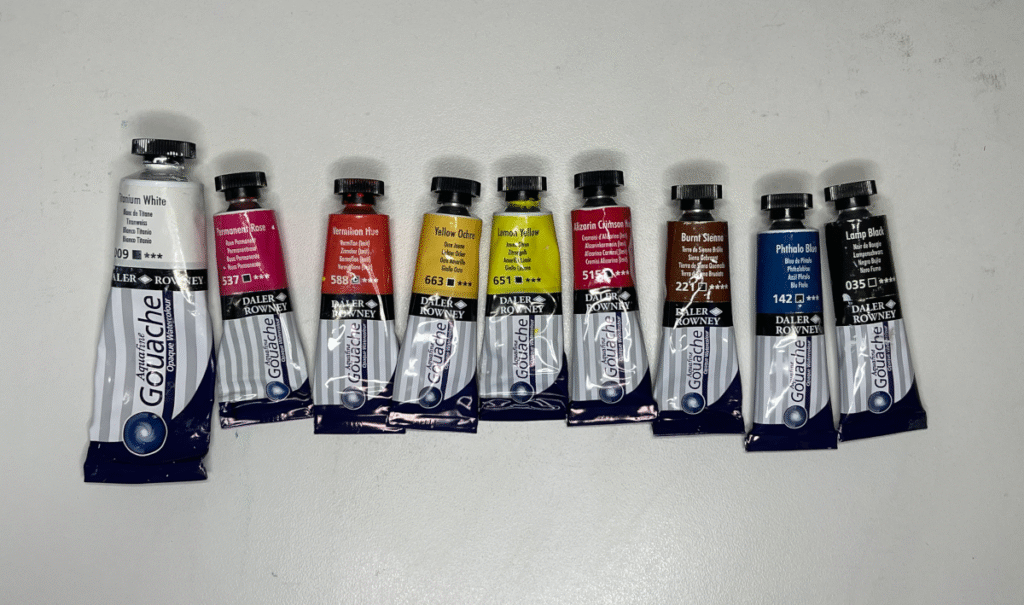
So, around 2023’s end, I decided to buy a set because I thought I could make them work to my way of painting. I chose Daler-Rowney’s Aquafine Gouache.
It was a disaster.
I couldn’t really blend anything. When I tried layering, the previous layers would reactivate and form clumps, leading to a very ugly appearance.
What was happening?
I thought it would be possible to reactivate gouache with a damp brush and blend it. That’s what I’d heard in a passing comment on a livestream where the artists were painting a certain subject in gouache. Guess not. I mean, I could reactivate it, but the results were horrible.
Was it the paper? I tried it on both student-grade wood pulp paper and professional grade watercolor paper 100% cotton. But I still got the same results either way.
So, I wanted to switch to watercolor. And so I did. I did watercolors for about a year – I don’t post everything I’ve done, but it was for a year. I did studies and one or two major watercolor paintings offline.
But then I started trying to paint paintings for here, and I immediately found I wasn’t getting satisfaction. I wanted to paint positively like in oil or acrylic when I had to paint everything negatively. Negative painting means where you paint around the subject rather than paint the subject on top of everything else.
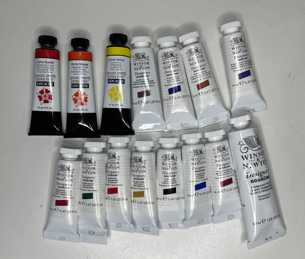
I had the idea that I needed gouache. It was a surprisingly strong feeling. But I remembered that as I had perused forums, people had told other that you really needed pro-grade gouache. Last time, I decided not to opt for this more expensive paint because if I had purchased it and still gotten the same results, it wouldn’t have been worth it. Nevertheless, I believed that I really needed it. I purchased a combination of colors from the professional lines of Winsor and Newton and Daniel Smith.
The idea initially is that I would do an underpainting of watercolor and paint opaquely with gouache over it. This would satisfy my desire to be able to paint positively over an underpainting.
But I experimented with my pro-level gouache, and I found… that it was worlds apart from the incredibly inferior student-grade gouache I had bought.
Now. Now everything I wanted worked.

I would likely be moving away from watercolor at the point. At least for a time if not forever.
I got that clumpy effect with the student grade. Not so with the pro-grade gouache. I could reactivate the paint, and it would still stay smooth in coverage. I’ve read that student-grade uses dextrin for a binder, while pro-grade uses pure gum arabic, and maybe that’s why. Dextrin takes some stirring to become fluid. That could explain the clumping.
The student-grade gouache would also lift. I mean seriously big holes in the paint coverage. Not so much with the pro-grade. It doesn’t seem to lift, even if I go over it a few times with a damp brush. Yes that will happen if I go too many times, but it can stand up to it – it resists lifting. Perhaps that’s due to the pigment loading that pro-level gouache has that student-grade does not. Could also be due the binder as well again.
Comparison Between Student- and-Professional Grade Paint
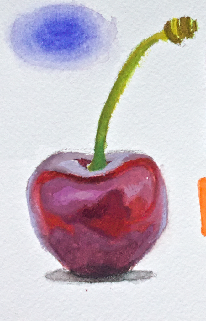
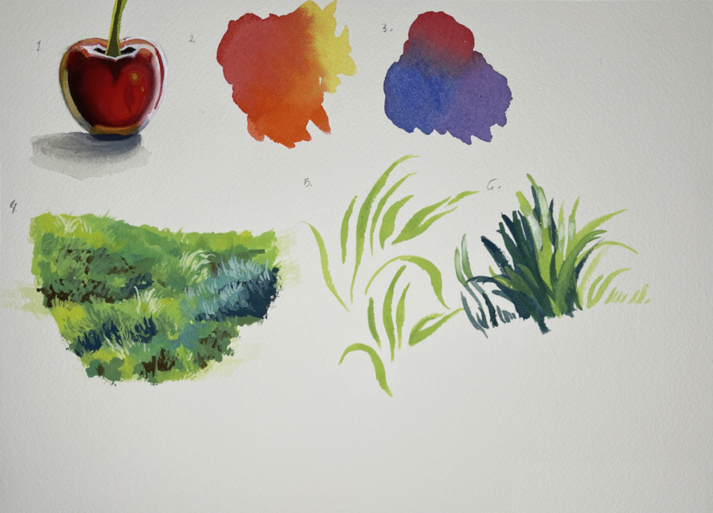
Here are the painting exercises I’ve done with the student-grade paint:

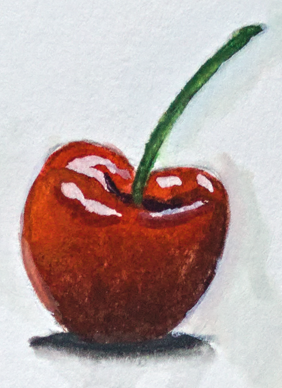
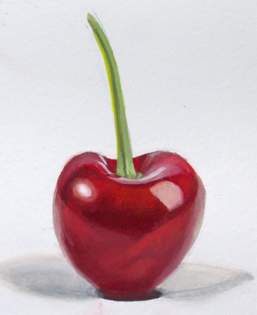
And really, right now all I’ve done in the pro-grade to my satisfaction is the cherry I just painted.

I don’t know why I like painting cherries for practice, but hey, that gives me the perfect opportunity to show a difference. I’ll compare the three cherries I’ve done.

While these three paintings aren’t exactly the same cherry, you can see how much of a different result I’ve gotten. With the left two examples, which has the student-grade paint, they’re awful. The paint is ugly, clumpy. And as for the right example, the pro-grade gouache, I was able to keep the paint surface smooth and pleasing.
Those first two cherries, I was really struggling. Wondering why I was getting holes in the paint coverage as I tried to blend. Wondering why it looked horrible.
It’s the paint.
At one point, I thought that it was the paper. But the cherry I did with professional-grade paints is also done on wood pulp like that example with several objects on it. And then, the second cherry was done on 100% cotton paper.
Conclusion
I’m, of course sticking with the professional grade paint, and I would never return to the student-grade paint.
Even before this, I had read just by searching forums that I really should get pro-grade paint. I’m kicking myself now because not only did not do that, if I had decided to buy the professional-grade paint, I wouldn’t have lost a year.
Well I bought them now.
You know, there were other problems with the Daler-Rowney student gouache.
The tube of Phthalo Blue was mostly binder. I had just thought that’s the way it was supposed to be. I don’t know why. Now that I see that the Phthalo Blue in the pro-grade line is full-bodied like you’d expect, I feel foolish.
Aside from that, I found myself having to apply paint over and over again – it just felt too translucent. I thought gouache was opaque. What was happening here? Of course, it had to do with the pigment loading. I was using up so much of my tubes of gouache, not making anything opaquer because of so little pigment load.
Contrast this with the professional-level paints where I’m really stretching them, thinning them down with water, and they’re staying opaque. I’ve barely used up any of my pro-level paint tubes.
Daler-Rowney no longer sells its Aquafine gouache line in the US. Apparently, it didn’t sell well. Can’t imagine why.
If I were to advise aspiring gouache artists on what to buy, I’d tell them don’t skimp on paint. You can even get away with student-grade wood pulp paper, as I’ve shown, but not the paint. If you’re on a budget, go with three colors – cyan, magenta, and yellow, along with a black and a white.
My recommendations are Phthalocyanine Blue, Permanent Rose, and any good Canary Yellow looking yellow color. I use a Benzimidazolone Yellow from Daniel Smith (the only brand that seems to have a Benzimidazolone Yellow), which is named Lemon Yellow on the tube. For me, that’s because it has excellent lightfastness. Most other yellows in gouache are Hansas, which should have fair to good lightfastness, but for the purposes of practice they should be fine.