
I did decide to practice a bit more. I’ve decided that if I just jump in like last time, I may make critical mistakes again, leading me to need to restart, wasting both time and materials.
Tree Bark
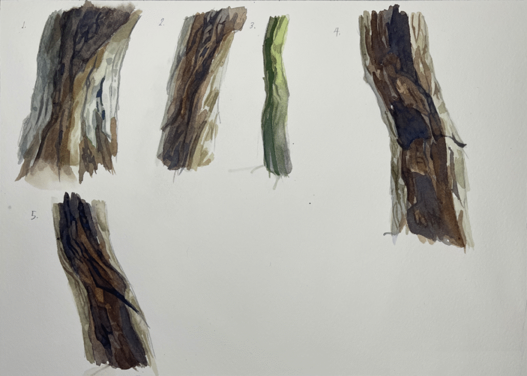
Lots of experimentation here.
I needed to decide the best way to approach tree trunks. I looked at my references, studying them as closely as I could.
I came to decide my best procedure was:
- Light wash to start, as always.
- Put in the crevices. In watercolor, yes, you need to start from light to dark, but I find my pencil work washes away. I put in the crevices first, hoping they would show up through later layers.
- When it comes to the shadows, I need a few layers. I’ve found that my chosen mix of brown and gray, consisting of Ultramarine and Burnt Sienna, needs a few layers to be strong enough.
- After I lay down the initial washes, further darker washes need to be put in with broken color and smaller brushes.
- Looking closely, I found that there aren’t many areas where you see smooth, seamless, soft transitions. Rather there are areas of broken, hard-edged colors and values, creating the look of bark.
- Careful control of values would allow for a three-dimensional look even with broken color.
- Both the area receiving principal light and the area receiving indirect light needed to be broken up as well, but I needed to do that carefully with values that would stay close to the base washes.
- Finally, if the crevices had faded, I’d need to darken them once again.
Rocks
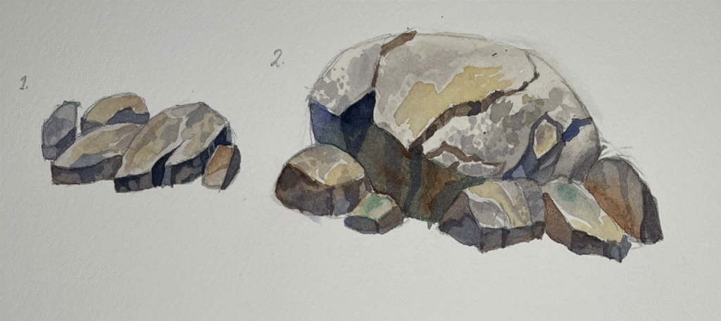
The rocks went a little faster, a little smoother. I think that’s because I warmed up on creating organic shapes when practicing painting the tree bark.
In creating the rocks, I had to
- Carefully design them in pencil first.
- Use a very light wash of neutral colors.
- Bring up the different mottled colors on the rocks.
- Drop in colors in shadows. I used confident, strong washes of blue and brown unmixed on the palette, and allowed to mingle on the paper.
- I’d bring the shadows to their final level of dark through washes of gray.